
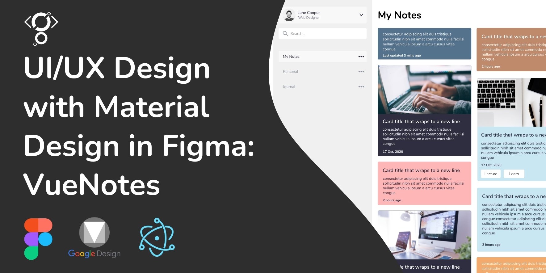
Designing a Note-Taking Web App with Google Material Design
Hey there! 😎
Today, I’m super excited to walk you through how I designed a note-taking web app using Google’s Material Design in Figma. Let’s dive in and see how to make clean and user-friendly interfaces together!
As a designer, I'm always looking for ways to create intuitive and user-friendly interfaces. Recently, I embarked on a project to design a note-taking web application, leveraging the power of Google's Material Design system within Figma.
Material Design, with its emphasis on clean aesthetics and user-centric principles, provided a solid foundation for this project. Its structured approach to layout, typography, and interaction design helped me create a consistent and visually appealing user experience.
One of the key aspects of Material Design is its focus on real-world metaphors, using concepts like elevation and depth to create a sense of familiarity for users. This translated well into the design of my note-taking app, where I utilized cards and subtle shadows to organize and prioritize content.
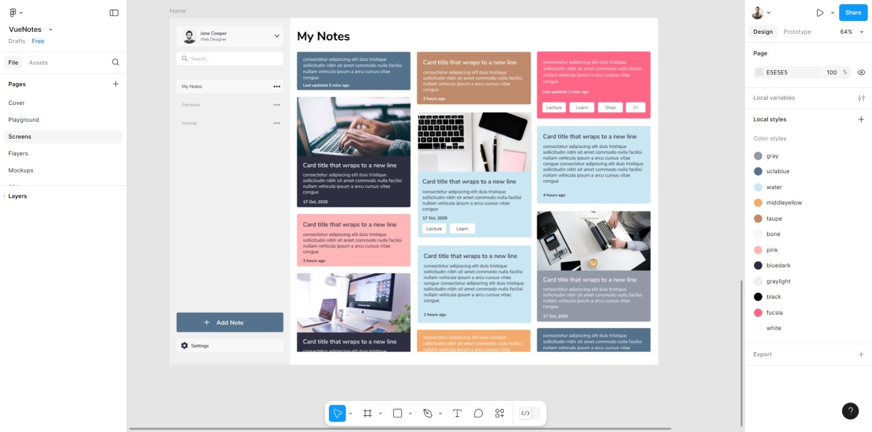
Material Design's responsiveness was also crucial in ensuring that the app would adapt seamlessly to various screen sizes. Figma's auto-layout features allowed me to create flexible components that could easily adjust to different viewports.
Consistency was another key factor in this project. Material Design's predefined components and styles helped me maintain a cohesive visual language throughout the app. This not only improved the user experience but also streamlined the design process.
The versatility of Material Design allowed me to explore different layout options and interaction patterns. I was able to create a clean and intuitive interface that prioritized content and user flow.
See the result of the design implementation below:
In conclusion, using Material Design in Figma proved to be an effective approach for designing a user-friendly note-taking web application. Its principles and components provided a solid foundation for creating a consistent, responsive, and visually appealing interface.
For more details on this project, please visit: VueNotes App Proposal